The Role of Mobile-Friendly Websites in Modern Businesses
In the digital age, mobile devices have become an integral part of people’s lives. Today, over 60% of internet traffic originates from mobile devices. This significant shift has made mobile-friendly website design and providing an optimal mobile user experience a top priority for businesses. In this article, we will explore the importance of responsive design and mobile UX and their impact on business success.

Redlimoo Services: Ecommerce Web Design and Development
Build Your Online Store and Maximize Sales with REDLIMOO
1. The Importance of Mobile-Friendly Websites
a. Growth in Mobile Users
Data shows that more than half of internet users rely on mobile devices for searching, shopping, and daily communications. This clearly highlights the necessity of having a website that performs well on mobile devices.
b. Customer Behavior
Customers expect quick, simple, and convenient access to information. A mobile-friendly website can meet this demand, boosting customer satisfaction.
c. Impact on SEO
Google and other search engines prioritize responsive websites. This means that a mobile-friendly website not only offers a better user experience but also helps improve the site’s ranking in search results.
Real-Life Example: Amazon, with its responsive design and mobile focus, offers a seamless shopping experience that significantly contributes to its high sales.
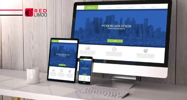
2. Responsive Design
a. Definition
Responsive design refers to creating a website that displays optimally on all devices (mobile, tablet, desktop).
b. Features of Responsive Design
Automatic scaling of images and text.
Simple and organized structure for smaller screens.
Easy access to buttons and menus.
c. Benefits for Businesses
Reduces bounce rates.
Increases user engagement.
Improves conversion rates.
Real-Life Example: Airbnb’s responsive design ensures a consistent and enjoyable experience for both mobile and desktop users.
Redlimoo Services: Industrial Web Design and development
Precision Engineering, Now Online!
3. Mobile User Experience (Mobile UX)
a. Definition
Mobile UX refers to designing an experience where users feel comfortable and satisfied while using a website on their mobile devices.
b. Key Elements of Mobile UX Design
Fast Loading Speed: Websites taking longer than 3 seconds to load lose 53% of users.
Touch-Friendly Design: Buttons should be large and spaced out for easy use.
Simple Navigation: Users should quickly access the information they need.
c. Advantages
Increases customer satisfaction.
Enhances user engagement.
Boosts sales and revenue.
Real-Life Example: Zappos, with its simple design and fast speed, provides a flawless shopping experience for mobile users.
4. Impact of Mobile-Friendly Websites on Sales and Engagement
a. Accessibility Anytime, Anywhere
Mobile-friendly websites allow customers to access products and services anytime and from anywhere.
b. Increased Online Sales
User-friendly design and an easy shopping experience drive higher conversion rates and sales.
c. Direct Interaction with Users
Tools like live chat and personalized recommendations help enhance customer interaction.
Real-Life Example: Uber’s mobile-first approach has made it one of the most successful transportation companies globally.

Redlimoo Services: Corporate Web Design and Development
Professional Corporate Website Design to Boost Your Business
5. The Future of Mobile-Friendly Websites
a. Emerging Technologies
Progressive Web Apps (PWA): Combining the best of websites and apps to provide a smooth user experience.
Artificial Intelligence: Offering personalized content and recommendations based on user behavior.
b. Increased Market Competition
Businesses that fail to provide a good mobile experience will struggle to compete.
Real-Life Example: Starbucks uses PWA technology to offer online ordering services on mobile.
In the modern world, mobile-friendly websites are no longer optional; they are essential for the survival of businesses. Responsive design and mobile UX not only boost engagement and sales but also build trust and loyalty among customers. Businesses must recognize the importance of mobile-friendliness and align their strategies accordingly.
In today’s digital world, having a mobile-friendly and professional website not only strengthens your online presence but also enhances customer engagement and significantly boosts your sales by providing an exceptional mobile user experience. Contact the expert team at RedLimoo today and take a big step toward digital success!